I like this
As a lighting designer, I see myself as a facilitator for art – one of the many team members enlisted to house a work of art. I join the artist, curators, architect, venue’s operators, and the maintenance crew in creating an environment best suited to any piece. In the case of a gallery or museum, the space best suited is often the most neutral, with the simplicity of a clean-pressed white shirt and the technical prowess of a self-driving car.
Art is beautifully unpredictable, infinitely variable, delicate and powerful all at the same time – an exciting and overwhelming realm to showcase. What feeling does the art exude? What language does it speak? What story does it tell? Although it is crucial to take time to explore the origin and feeling of the piece, it is easy to get wrapped up in what the art is trying to say. As the person who chooses the lighting, I remind myself to step back and reduce the question to: “What light will make it visible?”
The shape, size and texture of the art inform immediate decisions in choosing lighting. If we’re talking about a larger-than-life stone sculpture, it’s going to need quite a few sources coming from front, back, sides, and possibly floor. The distance of the light fixture to the art piece could quickly determine what power of lamp is required. During initial design phases, setting up several scaled sectional drawings of the piece within the architecture is key to examining how different beam spreads might fall on the object. Imagine how a spotlight makes different shapes and sizes of light on a stage. From this beam of light, we can choose how soft or harsh the edges need to be. For the most part, the beam wants to be soft and fluid, almost indiscernible.
Until quite recently, the LED world was not capable of adequately presenting art. The appropriate products from which we can now choose are still slim – but high quality products do exist.
A private residence we designed the lighting for in Chicago in 2013 called for excellent color rendering for art throughout the house, and at the time, halogen lamps were still the only show in town. We left the door open for upgrades to LED later by choosing MR16 bi-pin base fixtures, which was luckily possible because the jurisdiction’s code permitted that option.
Ancient Japanese Basket, Chicago residence
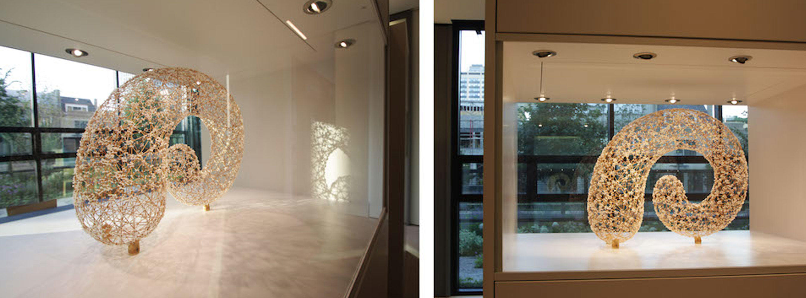
In San Francisco, we were enlisted to light a piece by Emil Lukas made of multicolored threads in delicate tension overlapping one another that hover over painted wood. Without enough light, the piece looks flat. We used two SORAA MR16 VIVID 95 CRI LED lamps in adjustable track heads to create just enough shadow from the threads to emphasize the depth of the piece, while also celebrating the colors.
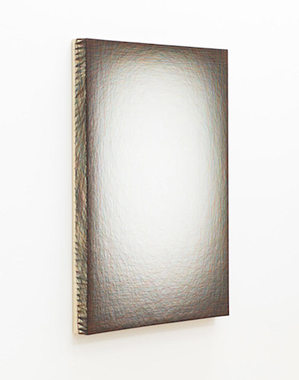
“Horizontal Ring” 78” x 96” x 3” by Emil Lukas displayed in private office, San Francisco.
In our residential and office projects, the challenge has been not knowing what the art is before designing the lighting. Best case scenario: the lighting designer can be kept onboard for the process of choosing art for a space, which often comes last in the sequence of construction. In a museum or gallery, flexibility is key to addressing rotating art. These days, with LED fixtures, new questions arise to retain flexibility as each manufacturer is assembling their fixture a bit differently. How does one change a beam spread in the field? Is it a film, optic, or does one have to replace the entire fixture? What color filters and accessories are available for the lamp or optic? What are the rotational adjustment capabilities of the fixture? What are the capabilities of the dimming system?
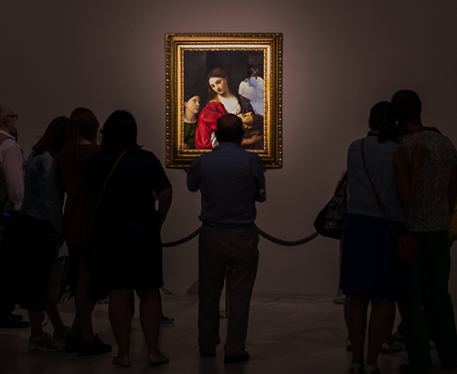
Yes, there’s an elephant in the room: what about color? Color is one of, if not the most important, challenging, make-it or break-it element of art lighting. What colors make up the art? If safe for the art, it is interesting to examine what colors exist under indirect sunlight. Sunlight reveals colors in the way the human eye is most accustomed to, which is what we strive to emulate with human-created light. Most pieces call for some recipe of white light, but what must also be added to the soup? Well, white light is white light, you may be thinking. Not so fast. White, especially in our current LED-centric universe now has more facets than it ever did, largely due to expanding technology of what we can build our white light from. Before adding any filter or accessory, we now have more opportunity to choose how the white light will render each color of the object.
There is also now opportunity to customize the viewing experience in more detail through lighting. Should any color in the piece speak more loudly than another? We can decide, through discussions with the artist and/or curator, that the piece deserves to have its red hue be a focal point. We would then choose a light engine that, through creation of the LED chip, or through a special optic or filter, has been dialed in to make reds richer and more vibrant – like SORAA’s ENHANCED Snap System accessory. This adds a tricky dimension to the display of art and the way we view it. Unless an artist or curator specifically requests light color studies and makes it a part of the installation from the beginning, my approach is to present all colors as accurately as possible. I can check for the right balance of color within my white light by using TM-30’s color icon, fidelity (Rf), and color gamut (Rg) values.
In a museum or gallery, lighting is preparing the canvas for its multitude of uses. In a residence, it is tailoring the design to each unique art piece. The ultimate goal is to make the art come to life and to show it proper respect.
Photo credit: Gabrielle Serriere, Emil Lukas via Artsource Consulting
Gabrielle Serriere, Senior Lighting Designer at ARCHITECTURE & LIGHT, has 11 years of experience in the field of architecture. After graduating with a Bachelor of Architecture from Cal Poly San Luis Obispo, she joined the ranks of architectural designers for six years in Lausanne, Paris, and London before returning to California and stumbling upon the unique field of lighting design. It’s been five years, and she still chooses to keep allegiance with the lighter side of things.
Related Products