Color Temperature: The What, How and Why
March 2018 - by Marc Langlois, Lighting Designer, Detroit Institute of Arts
I like this
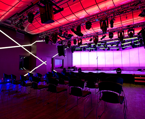
Color temperature can drastically alter one’s perception, mood and overall experience in a space. As lighting designers, we have the option to control our viewers’ emotions using simple shifts in color temperatures. No matter the application, color temperature can be used to accentuate different elements and blend an array of color temperature to best suit features in a space.
A few simple tactics can help us choose and blend more impactful color temperatures without making the changes apparent to viewers. In a museum, setting and blending these color temperatures can bring out an artist’s real vision as well as let the mediums really shine. When designing a new gallery, I follow these simple steps to decide my color temperatures.
What
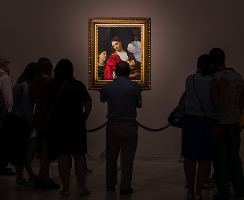
Simple and straightforward... What are you lighting? Is it a wooden sculpture? Stainless steel? Warm colors? Dark colors? These are all questions you should ask yourself when you start a new project. Different colors and materials are better suited for different color temperatures. Warmer materials such as wood lend themselves well to warmer color temperatures. Something around 2,700 kelvin is warm enough to let the natural material show its beauty, while at the same time allows adding 3,000 or even 3,500 kelvin into the room without a massive shift in color. On the other hand, end-of-the-spectrum materials such as bright greens, blues, and black look great under 3,000 kelvin. Something I often see overlooked in galleries and museums alike are placements of the art on surfaces not related to the artwork. Picking elements such as wall color and floor color/type should all be done under lighting conditions that are similar to what will be in the gallery – allowing for an accurate depiction of the color and texture you will realize when everything is installed. This saves the always-uncomfortable conversation when that beautiful color you saw in a conference room under fluorescent lighting is painted on the walls, but turns out to be a very different color when shown under the lighting of something like a SORAA VIVID™ MR16 lamp with a CRI of 95. Upon mastering this element of the project, you should focus on beam spreads and what types of accessories you’ll need to finish the job, which will be addressed in the next section.
How
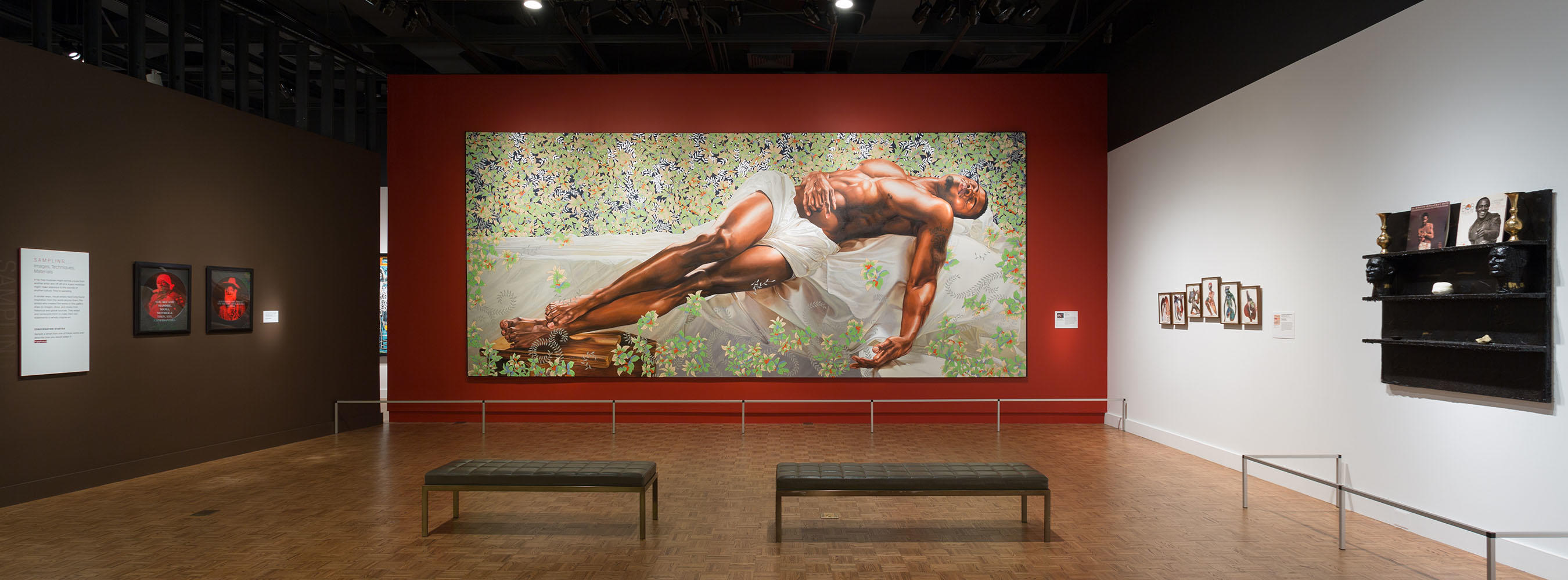
Building on the topic of What always brings you to this next point of How? I ask myself a series of questions: (1) How am I going to light it? (2) How did the artist intend for this object to be viewed? (3) How can I display this object to what the artist would be happy with? Unfortunately for the third question, we tend to deal with more artists that are deceased, rather than living artists where a simple conversation can happen. Often it is easiest if the object is not yet installed or even present to take a high-resolution photo and analyze the different portions of the object, the size of the object, and most importantly, any conservation restrictions you may be held to. Do not be afraid to do things that may seem silly – these short exercises can save you boatloads of stress in the end. For example, draw on printouts of the artwork to determine where you want to light it and the places where it may shadow, and note possible issues (see an example of how I conducted this simple exercise with Sleep by Kehinde Wiley). Select your beam spreads during this step as well. It is the ideal time to look at what your options are and how much area your lighting will cover. Then, take the time to assess any scenario you may encounter so problem-solving can begin from your desk – as opposed to 25 feet in the air in a scissor lift, unsure of the outcome (trust me, we’ve all been there!). Learn from my mistakes and sketch out every possible scenario on paper or on screen.

Why
The last and usually most important thing I think about is Why? Why did I make these choices? Can I explain my rational not only to fellow lighting designers but also to someone who has no lighting background at all – or most commonly to a curator? Can I show that every track head focused on the object is doing a specific job and has a purpose? And perhaps most importantly, why did I choose this intensity and is it within safe lighting conditions for the conservation of the object? This is usually the most difficult to those of us who have illuminated so many objects that we can light them in our heads. But, force yourself to slow down to consider the why, making sure you are doing everything in your control to provide everyone with the same excitement about an artwork you felt while lighting it.
I challenge myself to use this process as much as possible, and it has never failed me. It’s helped prevent issues that can lead to failure or rework, but it’s also meant easily forgotten details become more obvious to help maximize the creative process and ultimately produce a beautiful outcome. Lighting designers are always looking for ways to grow our skills so, we must always remember our main objective is to provide rewarding lighting experiences for those experiencing a space or a specific piece of art. This process will ensure that objective is met time and time again.
Related Products