I like this

Pianists of all levels of proficiency know of two methods of playing – playing technically by the notes on a page, or intuitively “by ear.” Both types of pianists are capable of producing colorful harmonies that impact human emotion. Few people, however, are able to master both.
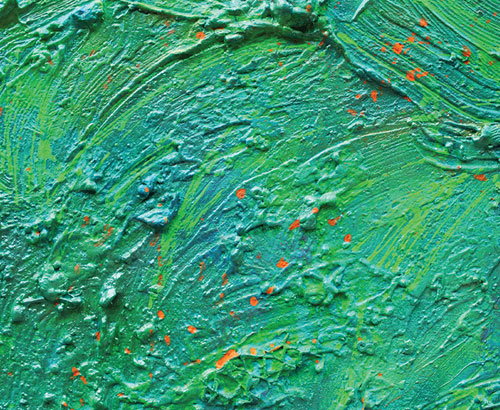
Compare, then, the world of music to the world of color, replete with its own technical and intuitive sensibilities. Most of us perceive colors as harmonious, or that otherwise cause us to feel certain emotions. Beyond the subjective, however, are there technical methods that lend authority to any person to define those combinations?
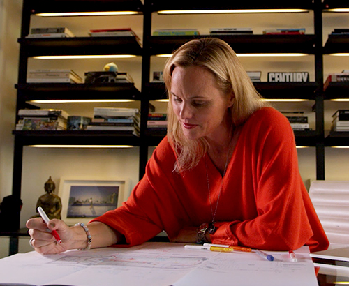
Leatrice Eiseman, internationally revered color consultant, author and executive director of the Pantone® Color Institute, has enjoyed a decades-long career that has manifested her expertise in the perceived and technical intersections of color – whether alongside each other, or with human responses to color in daily life.
SORAA is honored to partner with Eiseman, the company’s first ‘Master of Color,’ as both parties champion the importance of color in daily life. We recently spoke with Eiseman to understand and appreciate her journey to become a leading color expert around the globe.
Colorful Beginnings
Eiseman’s journey with color began during her childhood. Coincidentally, one of her earliest experiences with color included her family’s piano. Each year, her mother consulted her on which new color to repaint their upright piano – not to mention the entire home. Eiseman’s mother also granted permission for her to repaint her own room each year, including the furniture. She could pick any color combination she desired, and her mother would provide the paint and supplies.
“My interest in color began in childhood,” Eiseman said. “I was raised in an atmosphere where I was encouraged to do whatever I liked in my bedroom to express myself with color. We lived in a small row house in Baltimore, and my mother repainted the inside of the house every spring. I never knew when I was very young what colors she was going to choose, but as I got older, she consulted with me on colors we should use. Even the family piano got repainted every year. And when we finally moved out of that house, it had 20 coats of paint on it.”
“Give any child a box of crayons and they immediately start to scribble with great abandon,” Eiseman said. “They almost inherently know that the crayon is meant for scribbling, and as a means of expressing yourself.”
Colors in Motion
“If you need legal advice, you go to a lawyer,” Eiseman said. “If you need your tooth fixed, you go to a dentist. When you need the right color for a product or logo and millions of dollars might be hanging on it, you go to a color expert.”
Eiseman has engaged with some of the world’s most interesting and well-known brands, including her prolific leadership of the Pantone® Color Institute. Along the way, as she has experienced the use of color in a variety of industries and spaces, she has come to understand the function of color beyond what consumers may perceive as aesthetically pleasant.
“Aesthetics are important. There are lots of things to think about when making decisions in color, and you have to have that level of expertise in order to help those people across multiple industries make those critical decisions.”
Retail
Eiseman believes a person’s clothing may be the element in daily life where color matters most, whether she has advised on the factor of color for home interiors or some of the most prestigious retail environments in the world.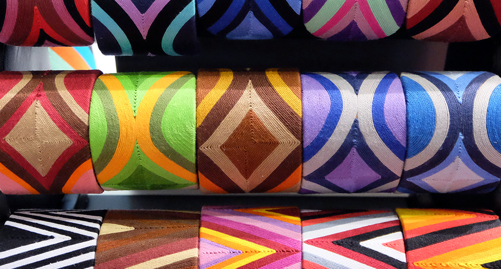
She recalls walking into the Donna Karan store on Madison Avenue in New York City. The store has extremely high ceilings. The store had a second-floor mezzanine, which Eiseman believes would go unnoticed without the proper use of color to create movement throughout the space.
“The boutique constructed an entirely red display using goods from the store and pieces they collected in varying shades of red—even a shiny red scooter,” Eiseman said. “When you walked inside, your eyes immediately swept the space, but they were drawn up to the mezzanine because of vibrant colors the eye just couldn't miss seeing. The red was sort of like a double whammy.”
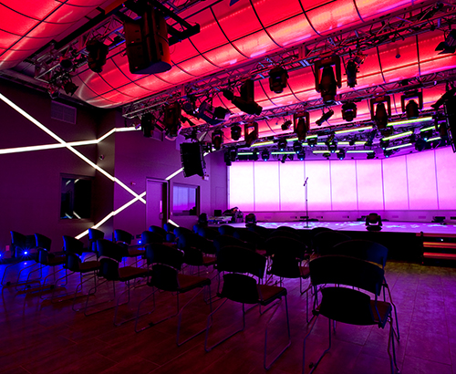
Healthcare
Eiseman suggests intentional awareness of color and light in healthcare facilities, which often have no windows to bring natural light into the space.
“In the CAT scan room, which is a terribly frightening situation for a lot of people, I once saw on the ceiling a mesmerizing, beautifully lit painting of outer space, allowing the patient to escape to another universe to help relieve their fears,” Eiseman said.
“Also, if you can imagine being confined to a room for a long period of time as many patients are, claustrophobia can become a concern,” Eiseman continued. “If you can create something that simulates blue sky, you can use color to make people feel that, yes, there is an outside, and I am connected to it. Anything that creates the illusion of being connected to colors as they appear in nature helps expand the space, green being, of course, one of the most important.”
Workplace
A common cause for the demand for Eiseman’s color consulting is to improve the experience and functionality of the space where most people spend a majority of their waking hours.
“I once consulted with a cosmetics lab where color matching is critical,” Eiseman said. “They said, ‘We're having this weird problem: Productivity is down in our quality control lab, and team members are seeing strange auras around their coworkers.’”
The employees were also experiencing headaches, eye strain, and higher occurrences of sick leave.
“So they opened the door into the lab and it was white as far as the eye can see,” Eiseman continued. “The work surfaces, the floors...White, white, white. But for the products they were testing – mostly in the red, hot pink, even purple families – everything was leaning red. For me, it was very obvious: When the workers are looking down at the products where they are trying to judge the color and then look away for a moment, they're seeing what is called the ‘after image.’”
Eiseman solved the problem by implementing to varying extents the opposite color to all of the reds: blue-greens. That immediately demonstrated that what people were seeing was the after image phenomenon that happens when you are staring intently at a color, you look away at a white surface, then see the opposite.
“Opposite colors bring balance to the eye when color matters – and it always does,” Eiseman said.
Museum & Gallery
An art collector herself, Eiseman finds it challenging to consult on art due to the subjectivity of the individual viewer.
“Some people think that the color of a piece of art is immaterial,” Eiseman said. “But, from an aesthetic standpoint, there are many people who are very sensitive to color and they want to provide a background for their art that really speaks to them and that doesn't interrupt or interfere with the art.
“A major part of my house is a kind of ‘dirtied-down’ yellow. I live in the Pacific Northwest, so we tend to soften the colors so they're not overwhelming in a gray atmosphere in the wintertime. I found this color to more closely simulate the color of sunlight. That warmth on the wall marries the warmth that is in the paintings and the art that we have.”
Color Perception in a World of Screens
Eiseman is not a purist who believes digital color is inferior to physical manifestations of color, but ensuring color consistency across the two platforms requires speaking the same language.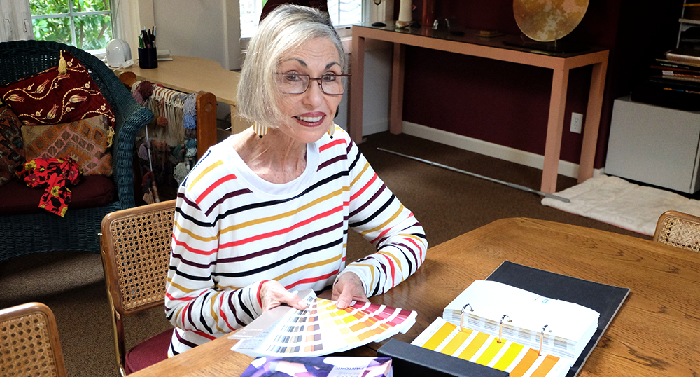
As part of her leadership at Pantone®, Eiseman helped define true color perception and usage on computer monitors, mobile phones and tablets.
“The Pantone® system has been a huge help to countless colorists and designers around the world, including my own clients who may be thousands of miles away,” Eiseman said. “If both parties have the system, we can be collaborating in the digital space or the physical world and referencing the exact combinations being considered.”
A Legacy of Color
Eiseman, who continues to scale her color empire as passionately as ever, hopes her work inspires people to use color more confidently. She hopes her robust trail of books, training programs, and partnerships with diverse brands equip future generations – from children to future colorists – with a knowledge of the value of their expertise.
“We can't all be Billy Joel and sit down at the piano and knock it out the way he does, but you can channel it,” Eiseman said. “The same goes for color, and people still enjoy and appreciate color as much as they ever have. As we begin to gain an understanding of how to properly use color, a world of possibilities can emerge in how we experience color in every part of our lives.”
Biography
 In addition to partnering with SORAA as its first ‘Master of Color,’ Leatrice Eiseman is the author of ten books on color, among them: Colors for Your Every Mood which was chosen as a Book of the Month Club selection and received an award from the Independent Publisher's Association; the Pantone® Guide to Communicating with Color; Color Answer Book; More Alive With Color; Color: Messages & Meanings, a Pantone® Color Resource, which won the Create Awards' Best of Industry award; and The Complete Color Harmony, Pantone® Edition, her most recent. Ms. Eiseman is a color specialist who has been called "the international color guru." Her color expertise is recognized internationally, especially as a prime consultant to Pantone®, the leaders in color communication and specification. She has helped many companies to make the best and most educated choice of color for product development, brand imaging, interior/exterior design, fashion and cosmetics, or any other application where color choice is invaluable to the success of the product or environment. Lee is also involved in color and trend forecasting for both fashion and home. She heads the Eiseman Center for Color Information and Training and is also executive director of the Pantone® Color Institute. Lee has been widely quoted in many publications and recognized by Fortune Magazine and the Wall Street Journal as one of the most influential people in the world of color. Ms. Eiseman delivers seminars on color worldwide. She is also a sought-after speaker for trade shows, schools, in-house business presentations, as well as webinars on color trends, consumer color preferences, the psychology of color, and its usage. Finally, Ms. Eiseman teaches all of the preceding subjects, and offers classes on those subjects twice yearly.
Related Products